
Hey everybody, it’s time for another trend report, this time from the Maison&Objet in Paris, the IMM fair in
Germany and some blogs from all over the world. This time, I’d like to focus my report on color because there
is not much going on that I haven’t reported on so far in my previous articles when it comes to form, material, finishings, etc.
So let’s see what happens with color schemes in the interior design world. Interesting enough, there is not THE color anymore. Yes, you do have pastels, and yes, there is grey, and other colors considered trending right now. Interior trends once relied on a certain Pantone code (and others), but now brands are working within their very own interpretation searching for a single PERFECT color. Let me show you what I mean and share the photos I collected.
let's start with....
PINK (offcourse it's Poneuves design blog !!!)
Pale pink is THE pastel color! It used to be almost the only one for the past few years. Now we see a bolder pink, we have peach, there is blush, bubble gum, and a long collection of other shades. When it comes to pale pink, it is often combined with grey for a cooler interior. But Now you can imagine pink with Black for more glam, with other pastels for something fresh or with wood for a more refined room.


RED
There is no fair or magazine where you won’t find some red pieces. Seriously. It is probably the color you’ll find literally as a ‘red thread’ through all the decoration events but never considered as a true trend. This time, I have seen red everywhere, probably linked to the trend we have seen in fashion this FW 13/14 season. As a statement piece, it will bright any space, you decide if you like it on your side table, armchair or if you’d even go for a bolder sofa. So, are you open to bright red, coral, dark orange, brownish red?


Spectrum/ Muuto / B&B Italia / Baxter / Danskina / Delightful Lamps / DePadova / Living Divani / Moroso / Normann Copenhagen / Luceplan
PURPLE
Oh, yeeesssss purple is defnitely still here ! Going from the darker violet spotted already in last years trends to brighter shades with a more feminine touch. But for now, dark shades are more common and gives a feeling of a certain sophistication and elegance.


So let’s see what happens with color schemes in the interior design world. Interesting enough, there is not THE color anymore. Yes, you do have pastels, and yes, there is grey, and other colors considered trending right now. Interior trends once relied on a certain Pantone code (and others), but now brands are working within their very own interpretation searching for a single PERFECT color. Let me show you what I mean and share the photos I collected.
let's start with....
PINK (offcourse it's Poneuves design blog !!!)
Pale pink is THE pastel color! It used to be almost the only one for the past few years. Now we see a bolder pink, we have peach, there is blush, bubble gum, and a long collection of other shades. When it comes to pale pink, it is often combined with grey for a cooler interior. But Now you can imagine pink with Black for more glam, with other pastels for something fresh or with wood for a more refined room.
RED
There is no fair or magazine where you won’t find some red pieces. Seriously. It is probably the color you’ll find literally as a ‘red thread’ through all the decoration events but never considered as a true trend. This time, I have seen red everywhere, probably linked to the trend we have seen in fashion this FW 13/14 season. As a statement piece, it will bright any space, you decide if you like it on your side table, armchair or if you’d even go for a bolder sofa. So, are you open to bright red, coral, dark orange, brownish red?
Spectrum/ Muuto / B&B Italia / Baxter / Danskina / Delightful Lamps / DePadova / Living Divani / Moroso / Normann Copenhagen / Luceplan
PURPLE
Oh, yeeesssss purple is defnitely still here ! Going from the darker violet spotted already in last years trends to brighter shades with a more feminine touch. But for now, dark shades are more common and gives a feeling of a certain sophistication and elegance.
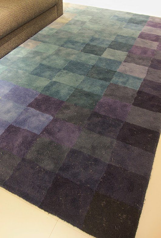
BLUES
Again light blue would be this year the key role coming from the pastel
color trend. Light teal is the hot spot. Petrol is another ongoing trend which I
suspect will be replaced during the next year. But watch out for more
moody colors to come mixed with a greenish and greyish tone and real
dark blue which is beautiful for sofas and decoration.
GREENS
Here we have grey-green, blue-green, moss green, olive, chartreuse, etc.
and the only newcomer for me this time has been a darker and rich
green. It looks precious on velvet, quite masculine and sophisticated. Green is hot in all shades, and I truly believe it stems
from the current indoor gardening trend. Green just feels natural,
refreshing and if not applied in a too bold shade, you don’t get tired
of it. And trust me,... I just painted our bedroom in a green-gray shade and it's looking great - so relaxing and warm at the same time :)
SUMMARY As a general observation: Colors get darker,
and there is an authentic color democracy... meaning every brand has its very own interpretation. What do you think about this observation? Is it good or confusing for the markets?
Xoxo
No comments:
Post a Comment